Agentic Analytics Platform
Empowering non technical teams to explore data and build stakeholder ready reports, without SQL, analysts, or a chat window as the product.
- AI
- Spatial UI
- Product Design
- B2B SaaS
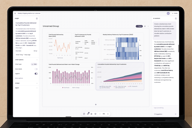
Business teams live and die by data. Campaign performance, pipeline health, operational throughput. But most analytics tools weren't built for them. Tableau, Looker, and even ChatGPT style interfaces assume technical fluency, SQL literacy, or the patience to prompt engineer your way to an answer.
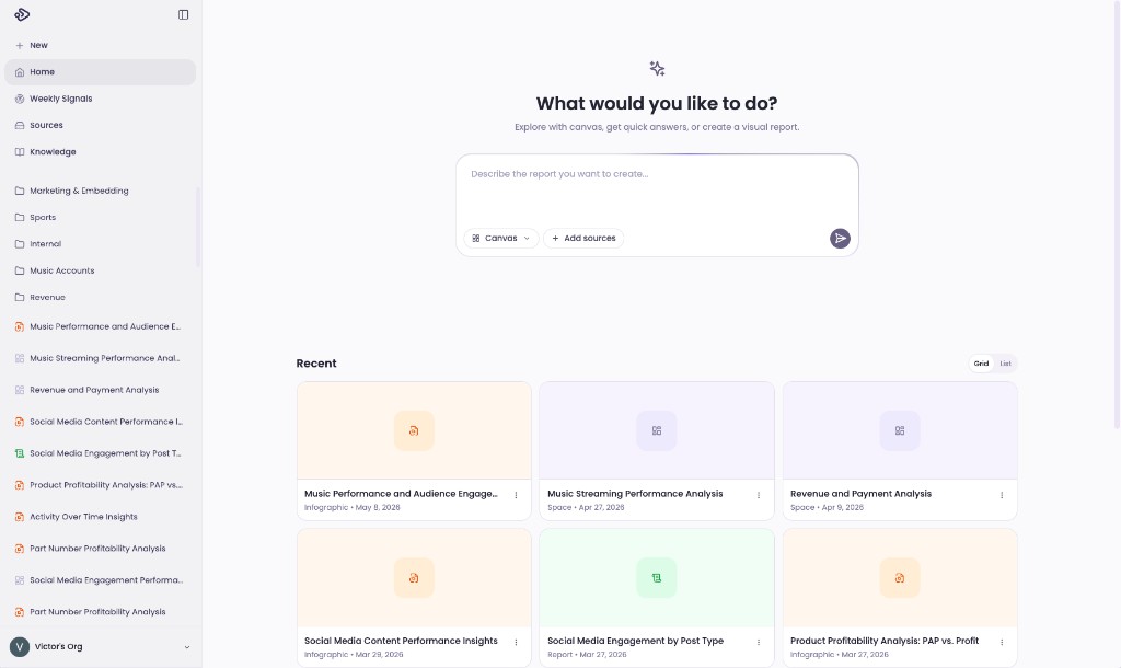
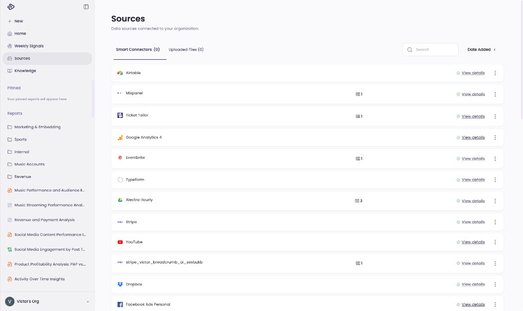
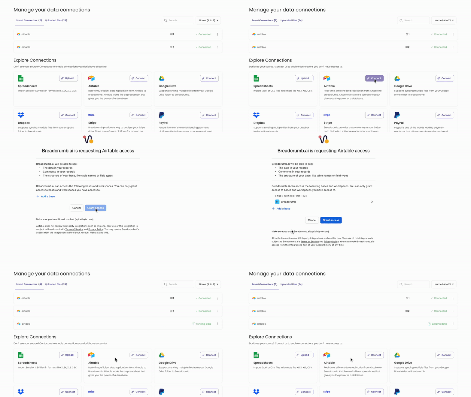
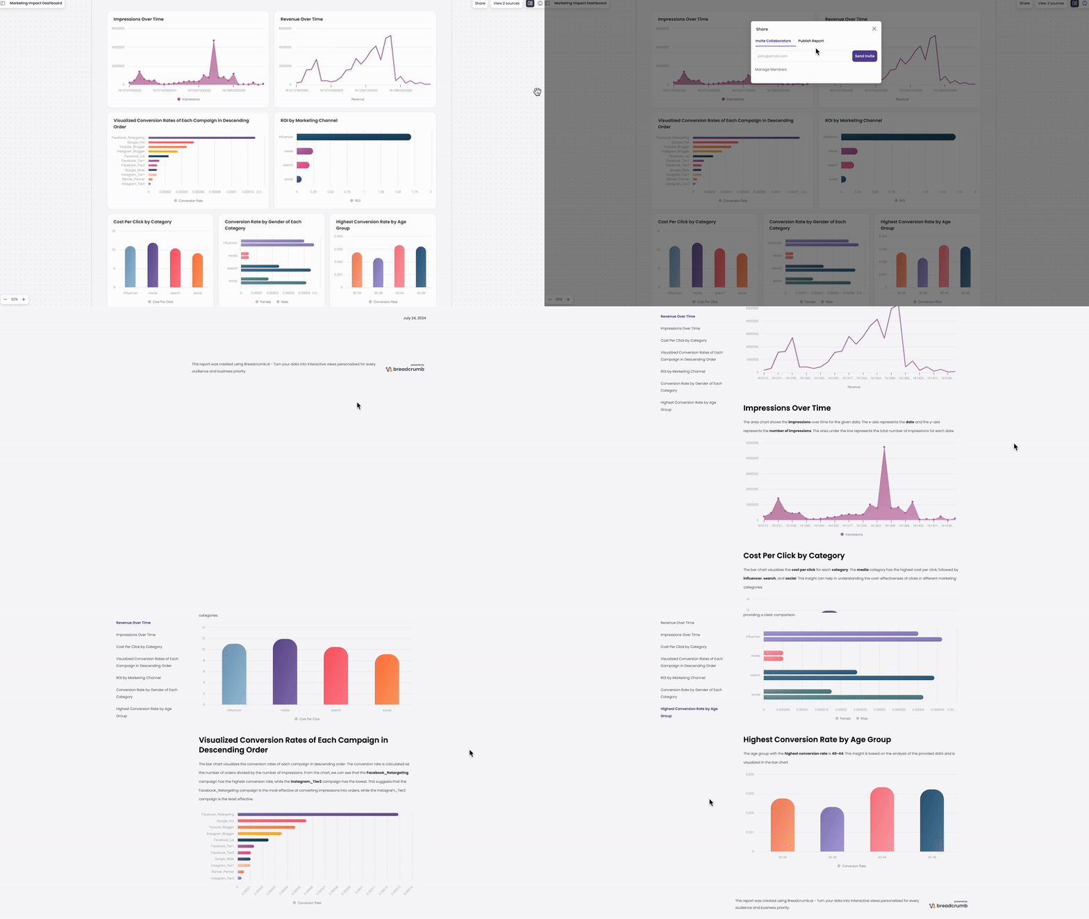
Breadcrumb set out to change that: a platform where marketing managers, ops leads, and sales directors could connect their sources, explore findings on a spatial canvas, and publish visual reports. No analyst in the loop, no query language required.
The problem
Across our early customer interviews, the same pattern kept surfacing. Non technical business users had the questions and the domain knowledge. They just couldn't get to the answers fast enough.
- Report requests to internal analytics teams took 2 to 5 business days, killing momentum on time sensitive decisions
- Existing BI tools required training most business users never completed, so adoption stalled after initial rollout
- Chat based AI tools produced answers, but users didn't trust outputs they couldn't inspect or reorganize
- Static dashboards couldn't adapt when the question changed. Every new angle meant starting over
The core job to be done was clear: let a regional sales manager or marketing coordinator go from "I wonder what's driving churn in Q3" to a polished, shareable report in one sitting, on their own.
Hypothesis & approach
We believed the bottleneck wasn't intelligence. Models were already capable enough. The bottleneck was interface. Conversation UI forces linear thinking; business exploration is messy, iterative, and spatial. People cluster ideas, compare scenarios side by side, and refine narratives as they go.
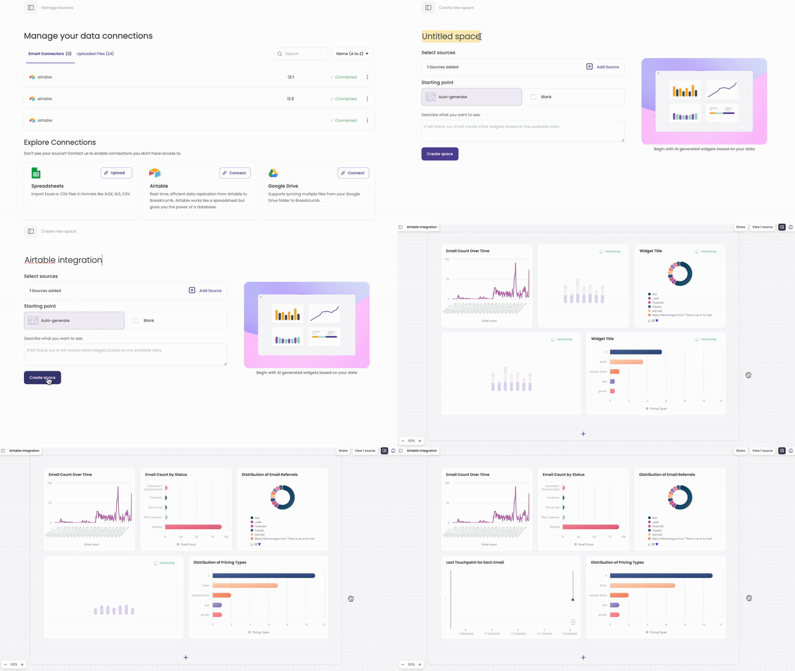
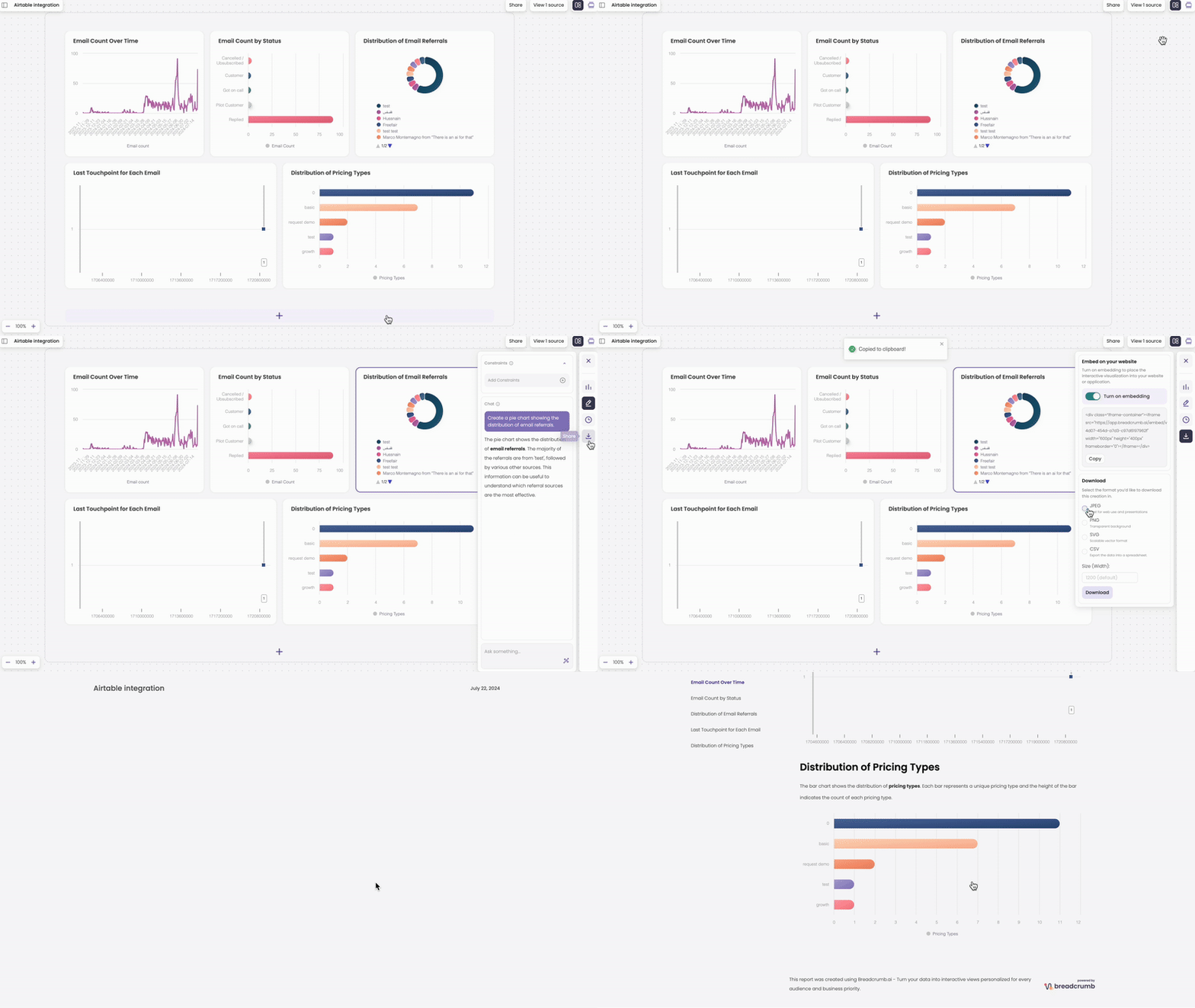
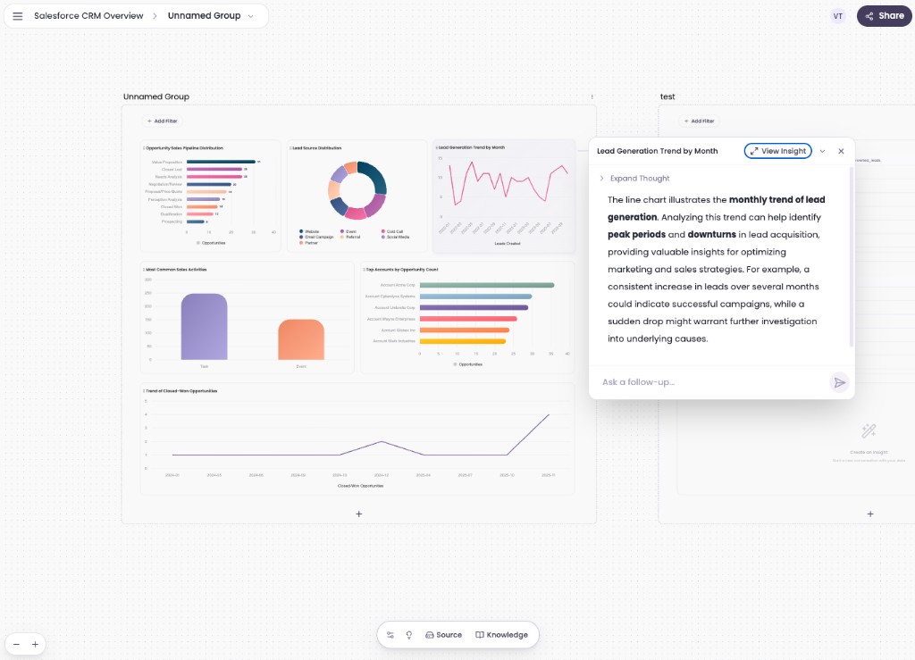
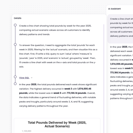
My design direction: embed AI into the workspace itself, not as a chat sidebar, and treat the canvas as the product. Connect data sources in plain language, generate charts as movable objects, and give users controls (not prompts) to reshape what they see. Transparency features like insight breakdowns and step by step reasoning would build the trust needed for business users to act on AI output.
The product
Key design decisions
AI embedded in UI, not conversation UI
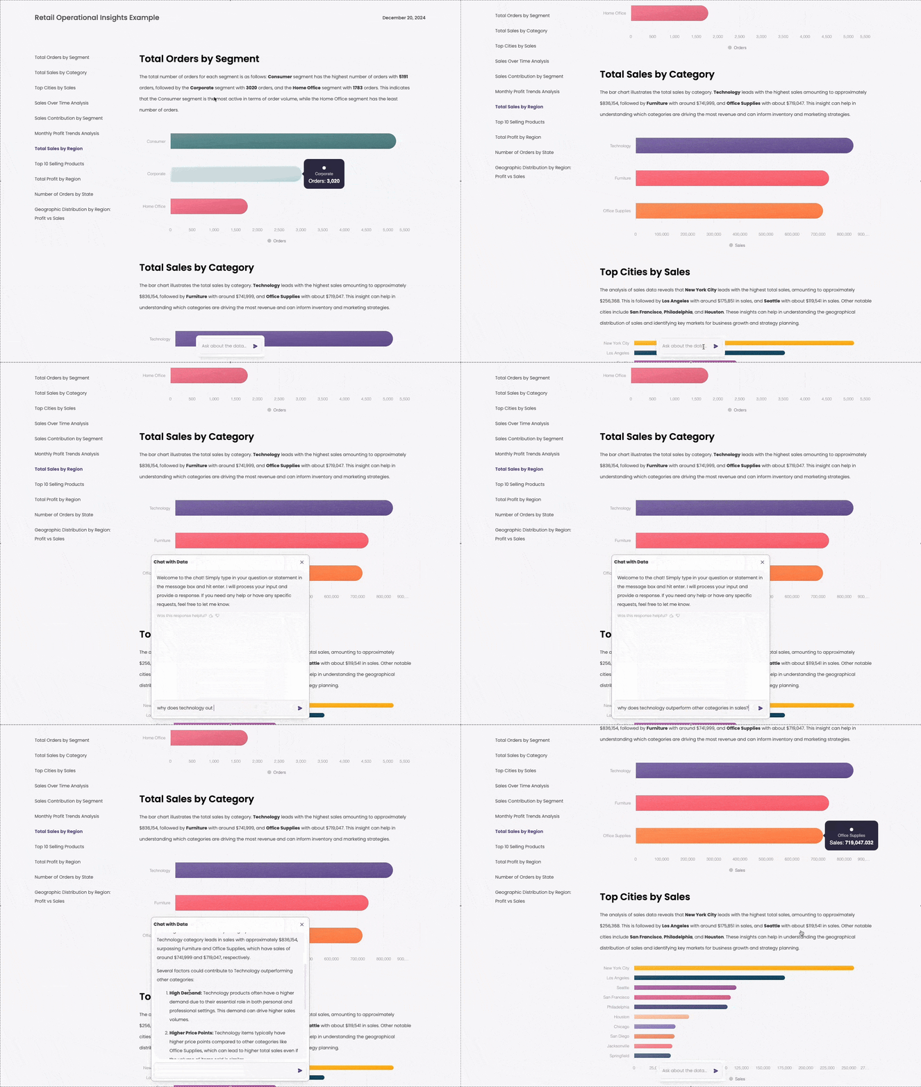
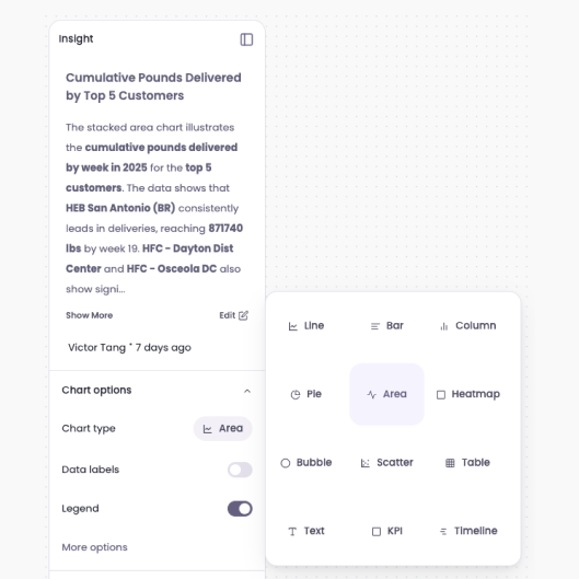
Rather than a chat first experience, AI capabilities live inside buttons, chart options, and widget interactions. Users switch visualization types, regenerate summaries, and explore follow ups without writing prompts, reducing cognitive load for non technical users who don't think in LLM instructions.
Trust through transparency
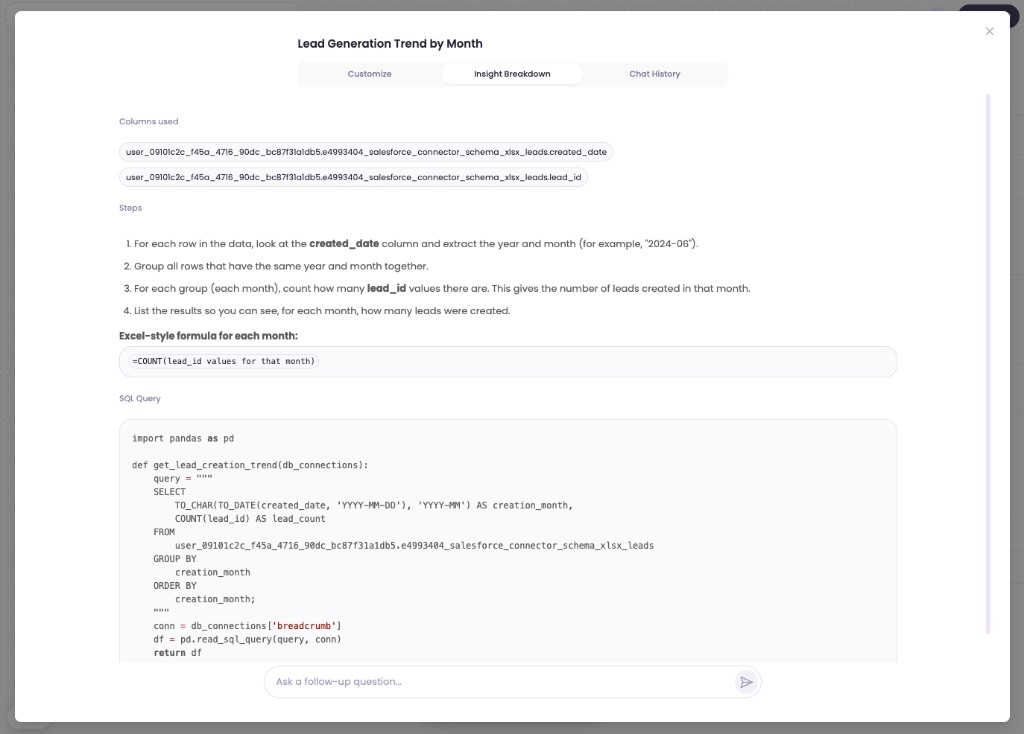
Business users told us they wouldn't share AI generated charts with leadership unless they could explain how the number was calculated. Insight breakdowns show columns used, processing steps, and the underlying query, turning a black box into something defensible in a board meeting.
Spatial exploration for non linear thinking
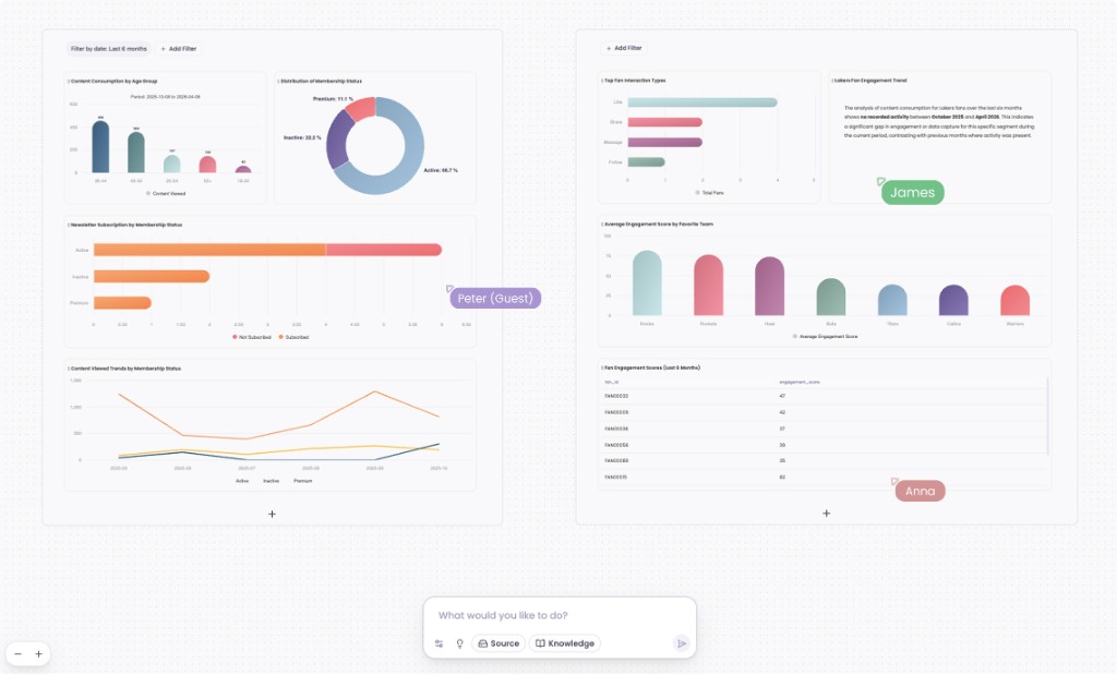
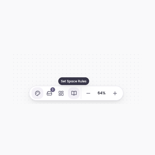
Users cluster related widgets, filter views by goal (e.g. "increase engagement"), and let the canvas encode context through layout, similar to how teams use Miro but oriented toward analytical depth. Proximity and grouping act as implicit prompts, so exploring a new angle doesn't mean starting a new chat thread.
Results
We ran an 8 week pilot with 12 users across marketing, sales ops, and customer success at three mid market companies. Success was measured by self serve report creation, time to output, and reduction in analyst dependency.
- 73% reduction in time to produce a stakeholder ready report (avg. 2.1 days → 28 minutes)
- 4.2× increase in self serve report creation among non technical users vs. their prior BI tool
- 68% of pilot users published their first report without training or analyst support
- 41% drop in weekly ad hoc data requests to internal analytics teams across pilot orgs
- 86% rated insight breakdown as "critical" or "very important" for trusting AI output
- Pilot expanded from 12 to 47 seats within 8 weeks; 3 of 3 orgs converted to paid
Qualitatively, users described the shift as "finally being able to answer my own questions." The most repeated feedback: they trusted outputs because they could see the logic, rearrange findings on the canvas, and share a polished report, not a chat transcript.
Breadcrumb proved that non technical business users will explore data and ship reports on their own when the interface respects how they actually think, and earns their trust along the way.
Final thoughts
This was built before LLM providers offered native visualization and code execution as a built in capability. Once that shifted, a meaningful part of what the product solved became something the underlying model could do on its own, and the need for a dedicated canvas layer went with it. The product was discontinued, but the core insight, that the real unlock is removing friction between a question and an answer, shaped the direction of everything that came next.
Next project
Transit POS system